

Dose is the framework toxicology uses to connect an environmental concentration to a biological effect. For air pollutants it is approximated as concentration × time × respiratory rate, and for a sedentary adult the respiratory term is roughly constant, so the useful number is exposure: concentration multiplied by time. One hour at 250 µg/m³ of PM2.5 and ten hours at 25 µg/m³ are the same area under the curve, the same exposure integral, and to a first approximation the same dose. But the two are not interchangeable, because biology cares about both the area and the peak.
Acute and chronic effects come from different mechanisms. A short high-concentration spike triggers acute responses: airway irritation, eye and throat symptoms, asthma exacerbation, a measurable inflammatory bump in healthy adults. Those responses are threshold-driven and they do not happen at low concentrations no matter how long the exposure runs. A long low-level exposure produces chronic effects instead: progressive cardiovascular damage, lung function decline, elevated risk of incident disease over years. The Harvard Six Cities study and the broader Lancet GBD work measured these long-tail effects directly, and the dose-response curves for chronic outcomes have no threshold: lower is always better.
That is why the public guidelines come in pairs. WHO 2021 sets a 24-hour PM2.5 limit of 15 µg/m³ and an annual limit of 5 µg/m³. EPA NAAQS sets a 24-hour standard of 35 µg/m³ and an annual of 9 µg/m³. The short windows protect against acute symptoms during episodes; the annual numbers protect against chronic disease across years. A household can satisfy the 24-hour limit on every individual day and still violate the annual limit if the daily average sits steadily in the 6 to 14 µg/m³ band, which is exactly what happens in most cities.
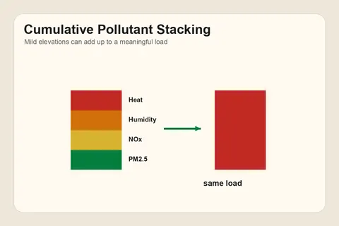
The dashboard reflects this by surfacing both. The current reading and the most recent hour answer "is anything happening right now." The 7-day, 30-day, and 1-year rolling averages answer "what is my typical exposure pattern, and where does it sit relative to the chronic guideline." A user whose 30-day PM2.5 average is 18 µg/m³ is above the WHO annual guideline even on days that individually look unremarkable, and the AI says so. What this framework does not capture: peak vs average susceptibility for individuals with pre-existing conditions, and co-exposure to multiple pollutants where PM2.5 + O3 + NO2 together do more damage than any one alone. The AI flags these qualitatively without trying to integrate them into a single number. See cumulative vs acute exposure and risk vs hazard vs exposure for the adjacent framings.
This is environmental information, not medical advice. The dashboard's readings help you make decisions about the air in your space. They do not diagnose conditions, interpret symptoms, or replace conversations with your physician. If symptoms persist, worsen, or coincide with a known exposure, talk to a healthcare professional. See the AI's medical-advice scope.