
What the AI can and cannot tell you
The dashboard interprets your air. It does not diagnose you, replace your doctor, or detect things the sensor cannot measure.

Filtered view. Return to /learn for the full reference.
The dashboard interprets your air. It does not diagnose you, replace your doctor, or detect things the sensor cannot measure.
The small set of words the dashboard uses with specific, defined meanings. Precision in the vocabulary lets the AI and the reader stay aligned.
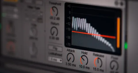
Each pollutant decays with its own characteristic shape. The shape is how the AI tells one event from another.
Minutes to seasons. Knowing which time scale a parameter lives on is half of interpreting it correctly.
Air-quality parameters do not change in isolation. Humidity pushes the VOC index. Ozone reacts with limonene to make formaldehyde. Knowing the interactions is how the AI avoids false alarms.
A bad afternoon and a bad decade are different problems. The literature is clear about which matters more for what.
Is your air normal? Population-level studies and the dashboard's own data let you compare to typical homes.
Three words public-health professionals use carefully. Loose usage in air-quality conversations causes most of the misinterpretation.
When the data does not match any known pattern, the dashboard logs the event and asks for help interpreting it. That is by design.
Apartments, townhomes, detached single-family, and commercial buildings each have characteristic air-quality patterns. The AI uses the building type as a structural prior.
Every reading on the dashboard has a source: a sensor on the device, a computation from sensor inputs, or an outdoor API. Knowing which is which is the first step in interpreting any of them.
PM10, PM2.5, PM1.0, ultrafines. Same physics, different particle-size buckets. The size determines where particles lodge in the body and what produced them.
EPA AQI, WHO 2021 guidelines, Canadian AQHI, European CAQI. Four different ways to summarize the same air.
HEPA, MERV, Corsi-Rosenthal. Three filtration paths to the same goal. Cost, performance, deployability differ in different directions.
Open windows, range hood, HRV/ERV, demand-controlled ventilation. Different ways to bring fresh air in and stale air out.
Anything that burns indoors produces a multi-pollutant signature: NOx, fine particulates, VOCs, ultrafines, and (sometimes) CO. The dashboard has a shared interpretation framework for all of them.
Mold, dust mites, pet dander, pollen, mold spores. Most household allergen exposure is one of these five. The dashboard groups them as a family.
Sometimes the air feels wrong even when all the numbers look normal. The dashboard integrates several parameters into a subjective-experience model that explains why.
Most households run on a 5-and-2 schedule. The air does too, in ways the AI uses to set its baseline.
A near-linear CO₂ climb that does not decay is the signature of a room rebreathing its own air. The math is straightforward and the pattern is unmistakable on the dashboard.
Two landmark chamber studies (Satish 2012, Allen 2016) show executive function dropping monotonically as CO₂ rises from 550 to 1,400 ppm. The shape, the domains, and the mechanism candidates.
For most outdoor-driven pollutants, indoor concentration divided by outdoor concentration is the single most diagnostic number in the dashboard. It tells you whether your house is sealed, filtered, or leaking.
Open-Meteo gives you hourly outdoor forecasts up to 7 days out. The dashboard uses them to suggest action before a problem arrives, not after. Here is how the forecast horizon maps to confidence.
Each of the three inputs is a signal. Combined, they let the AI predict whether an indoor event is about to happen, and recommend action before it does.
The dashboard speaks in three voices: confident, cautious, and openly uncertain. Knowing which voice you are hearing is half the value.
The dashboard will tell you about your air. It will not diagnose, prescribe, or speculate about your health. The line between those two is bright and intentional.
Accuracy, precision, and drift are three different things, and consumer-grade sensors trade absolute accuracy for cost and form factor. Here is what the numbers on the dashboard actually mean.
A short spike and a long low-level exposure can produce the same dose with completely different health implications. The dashboard tracks both because they answer different questions.
CO₂ does not measure pathogens. But CO₂ and exhaled pathogen droplets share a source (occupants) and a sink (ventilation), so the indoor-to-outdoor CO₂ ratio tracks the fraction of air in the room that other people have already breathed. This is why the Aranet model was widely adopted for ventilation monitoring during the pandemic.
"Sick building syndrome" gets used to mean three different things, and the difference matters because each leads to a different diagnostic path. Here is the disambiguation, with the room-by-room signatures the dashboard can and cannot help find.
Warm air rises, cool air falls, and exhaust fans push the balance around. The result is that pollutants move through a building in predictable directions, the basement supplies the bedrooms more than you think, and a bath fan can backdraft a water heater. The dashboard makes the patterns visible.
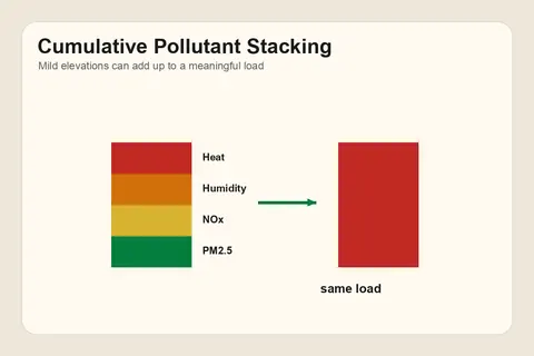
The body does not see pollutants one channel at a time. Mild PM2.5, mild NOx, mild humidity, and warm temperature can stack into a load that none of them would carry alone, and the dashboard reads them that way.
Breathe Better. Live Smarter.
One device. Six sensors. Twelve signals. Indoor readings connected to outdoor context and plain-English recommendations. Everything you just read can be measured live in your own home.
$249 USD one-time
Buy Terrestream Explore the sensorSix sensors. Twelve signals.
Built on genuine Sensirion, Bosch, and Texas Instruments sensors.
Included
Works with
Search the knowledge base.